on how a site grows
Measure a machine’s heart
Form & Agency
Jul 2023 — Sep 2023
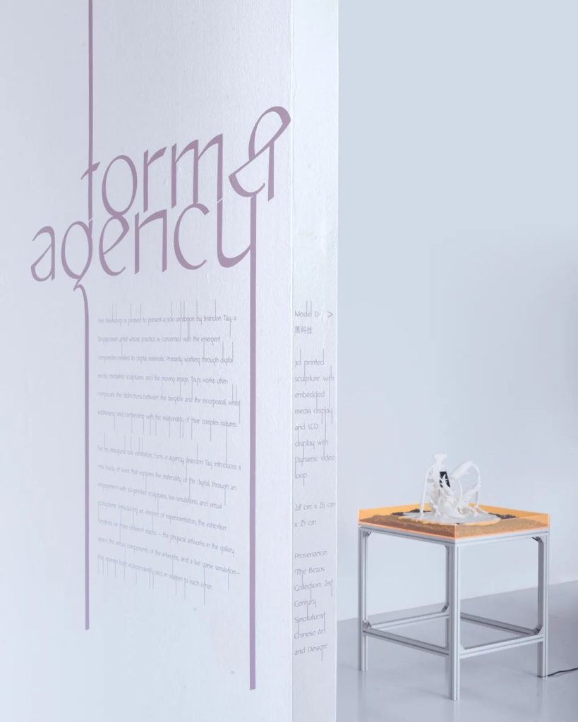
Form & Agency exhibition by Brandon Tay introduces a body of work that explores the materiality of the digital, through an engagement with 3D-printed sculptures, live-simulations, and virtual ecosystems.
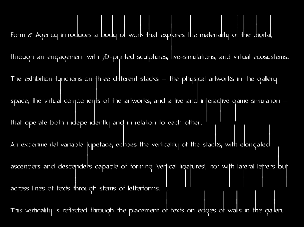
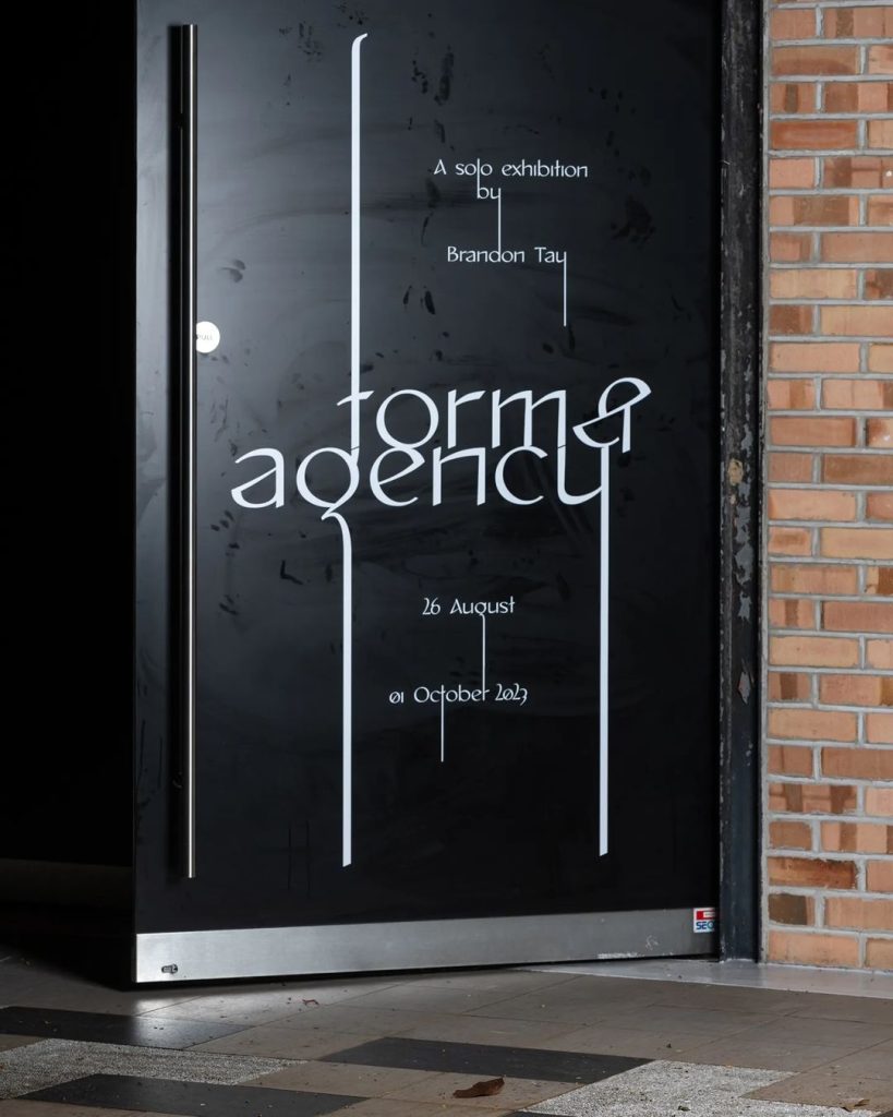
The exhibition’s visual identity, designed by Darius Ou, specifically places a spotlight on the variable typeface As Above, So Below. This typeface, characterized by its elongated ascenders and descenders, deliberately echoes the verticality of the stacks. It boasts the unique capability of forming ‘vertical ligatures’ not between adjacent letters but across lines of text.

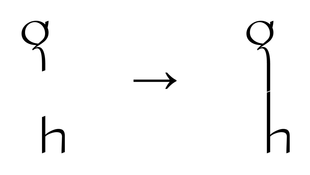
However, there isn’t an existing OpenType feature for this particular type of ‘weird’ ligature. Moreover, creating the vertical ligature is a more intricate technical process than the usual ligature because it relies on the positioning of letters vertically adjacent, which can shift significantly when we adjust the width of the text box.
That’s when Darius approached me for a collaboration, with the goal of bringing this feature to life through coding.
1. Type tool for graphic design
Technically, Darius could use the font without coding, but it would require painstaking manual calculation and replacement of each character with its long-ligature counterpart. To simplify and streamline this process, my primary task was to develop a tool that would enable Darius to efficiently implement the font across all the graphic design assets. The tool would be deployed as a website for convenient use.
I even went as far as creating an Indesign script so that it can be even more adjustable within the design softwares. No need to switch to a separate online tool, streamlining the process.
2. Website Development
This website is another tiring journey to develop. I started the process of design and development all together just two weeks before the exhibition’s opening, which was a hectic speed run.
Here’s an extraction from Darius’s writings on the exhibition visual identity: ‘We think of ligatures as inherently generative, (connecting/aligning parts of letters) yet born from adversarial conditions (clashing of letters’ forms). One of the concepts (borrowed from biology) in cybernetics is autopoiesis: described as living entities/ machinic systems with versatile adaptive behavior capable of maintaining themselves, grow, and reproduce. As above, so below—through code—gains the ability to form vertical ligatures across lines, binding entire texts as ‘organisms’.
These texts adapt to external (adversarial) influences, re-organise, and react; while always maintaining these ligatures through letter stem(cells), rhizomatic, shapeshifting into new forms.’
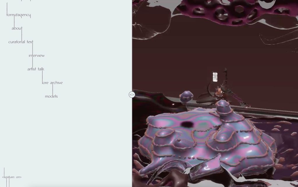
The website continues the identity’s obsession with the threshold, this time splitting the browser into 2 separate spaces. The navigation bar texts exist in a space of their own, linked to the content space on the right. This allows for the ‘live’ texts to be shaped by the browser, and in turn, the typeface adapts to the space.
3. ETYM(YTH)OLOGY
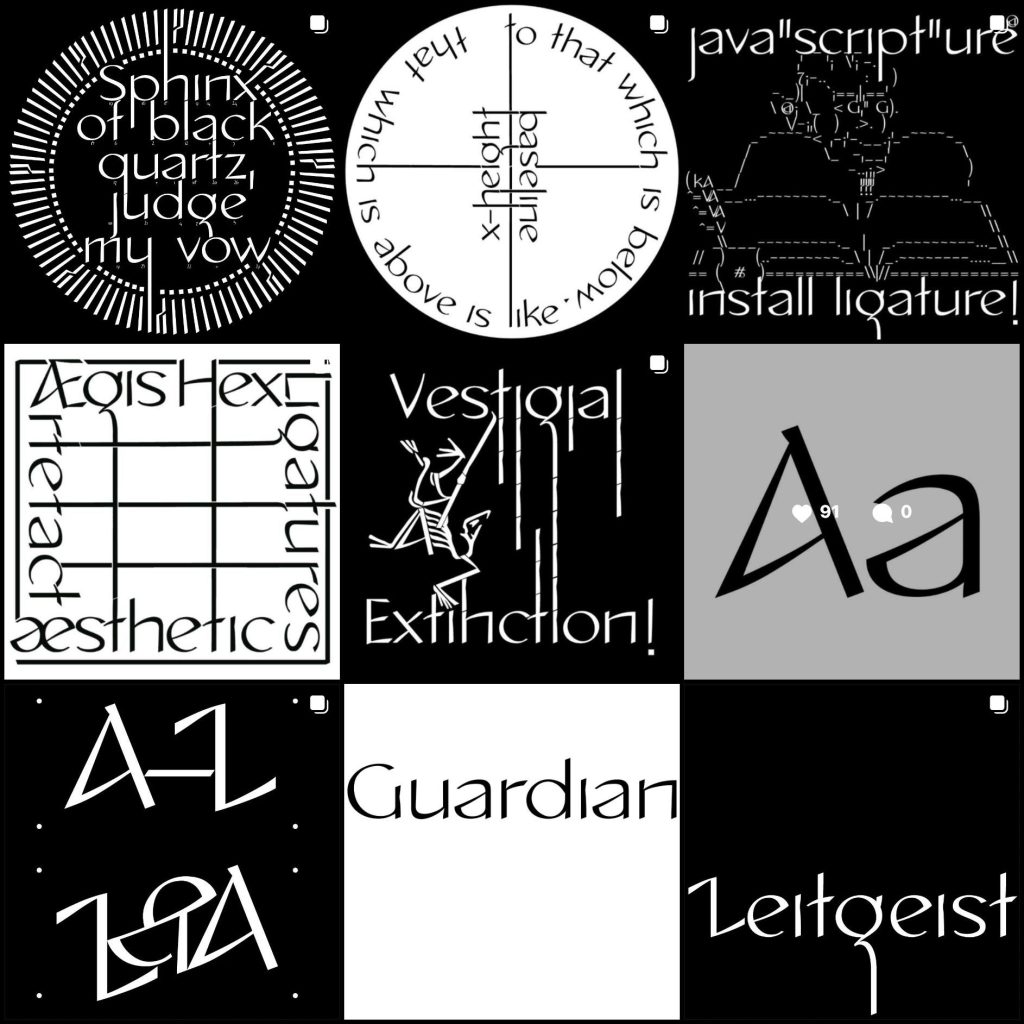
Throughout the identity development process, Darius crafted a fictional lore for the typeface as an integral part of the exhibition. This lore wove together a series of ideas rooted in the etymologies of the Latin alphabet, interwoven with semi-fictional myths. He published them on Instagram www.instagram.com/p/CxP1EbJSv_W/?img_index=7.
This is a fun work I did on top of this written, using gpt-3.5-turbo API. It’s still a WIP because I initially attempted to fine-tune the model to better comprehend the lore, but that didn’t go as planned. In the future, I’m considering alternative methods, such as using embeddings, to integrate chat responses as part of the written lore.
- Visit the exhibition site here formandagency.net or formandagency.vercel.app
- Take a look at the github repository.
- Visit the “type generation tool” site here vanghoa.github.io/AsAboveSoBelow/oldsite/
- Take a look at the github repository.
- Visit the “AI text” site here vanghoa.github.io/AsAboveSoBelow/.
- Take a look at the github repository.
- Bảo Anh as web designer and creative coder
- Darius Ou as design director and graphic designer
- This project was done for Brandon Tay’s exhibition–Form and Agency, curated by Rafi Abdullah
