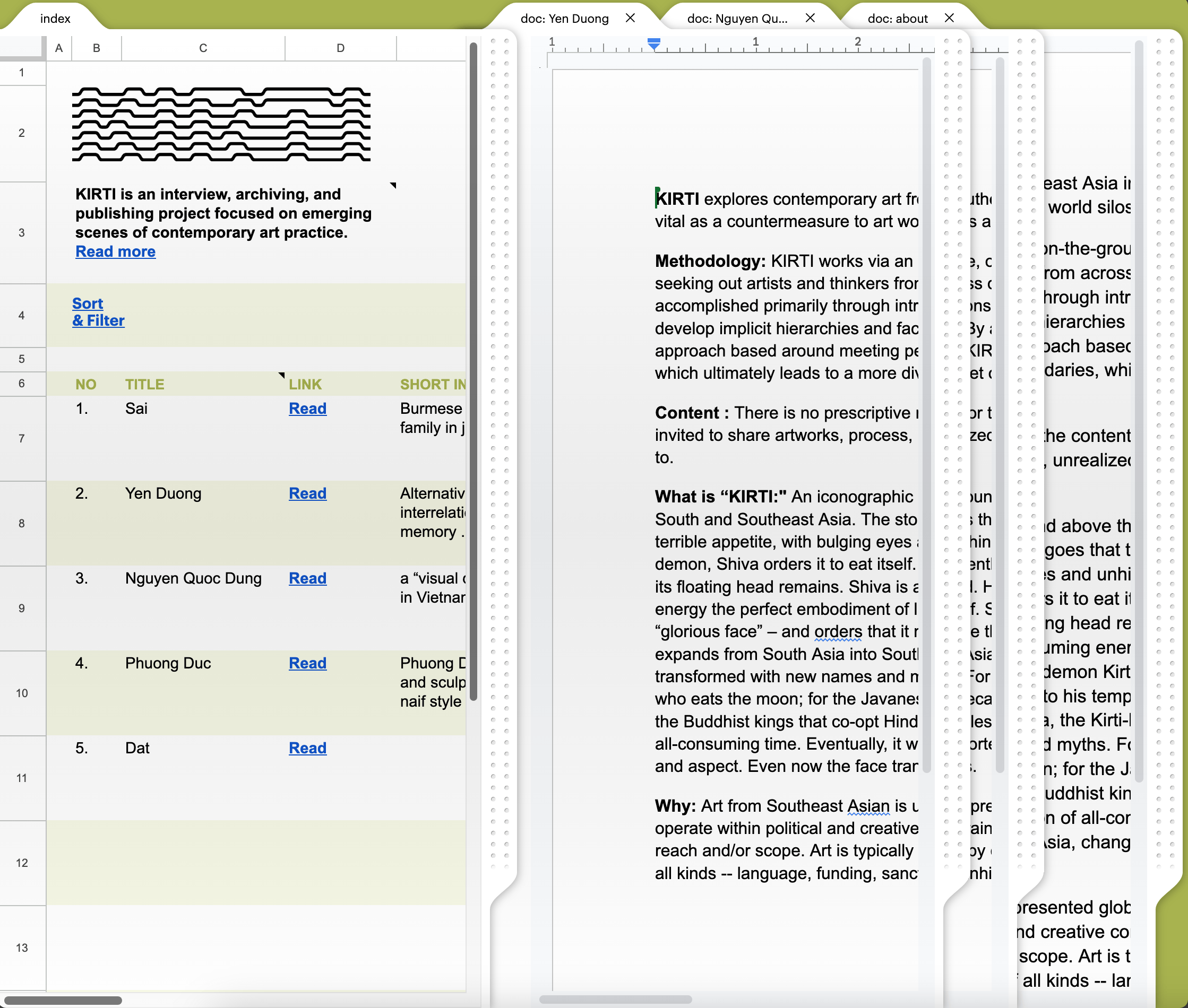
google sheet + google doc ?
Nam Bắc Một Nhà
Jan 2023 — May 2023
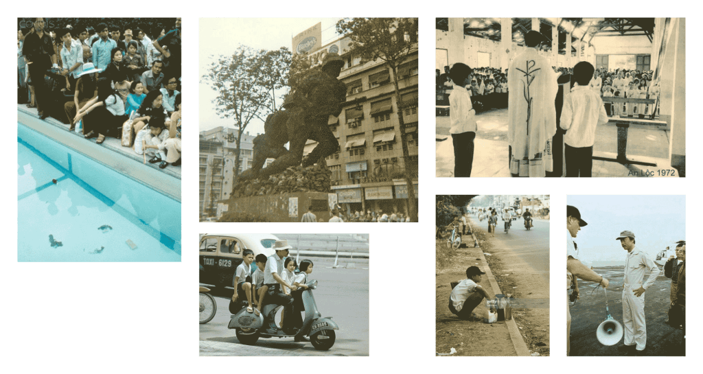
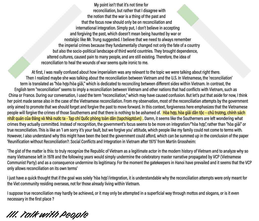
Despite the reunification of Vietnam nearly 50 years ago, the division between the people from the North and South Vietnam still remains, a lingering result of the Vietnam War. This project, “Nam Bắc Một Nhà,” envisions a National Reconciliation Day that aims to celebrate all memories of the Vietnam War, particularly those that have been suppressed, avoided, or ignored by both the general public and the Vietnamese governments.
- Visit nam-bac-mot-nha.vercel.app to see!
- Take a look at the github repository of the site.
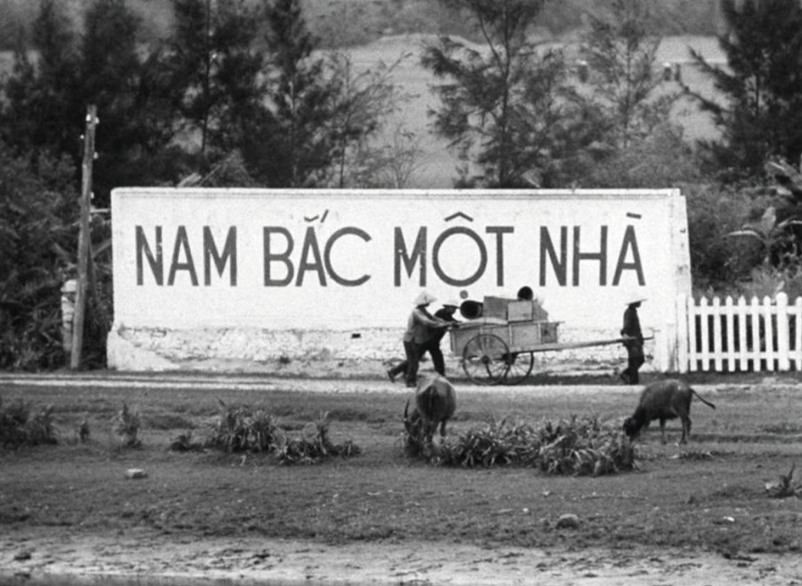

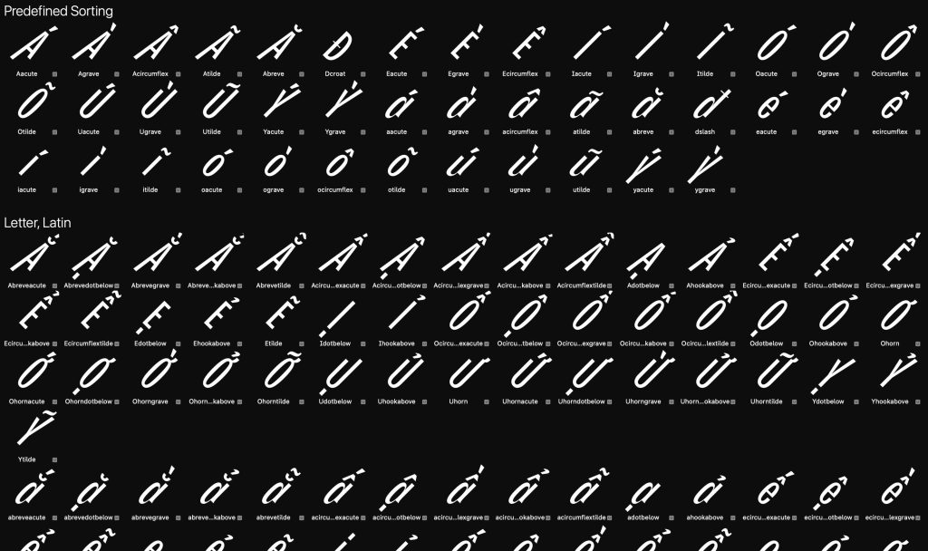
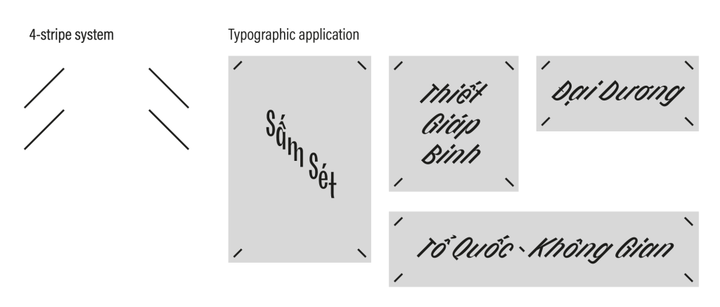

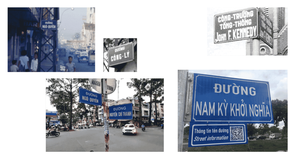
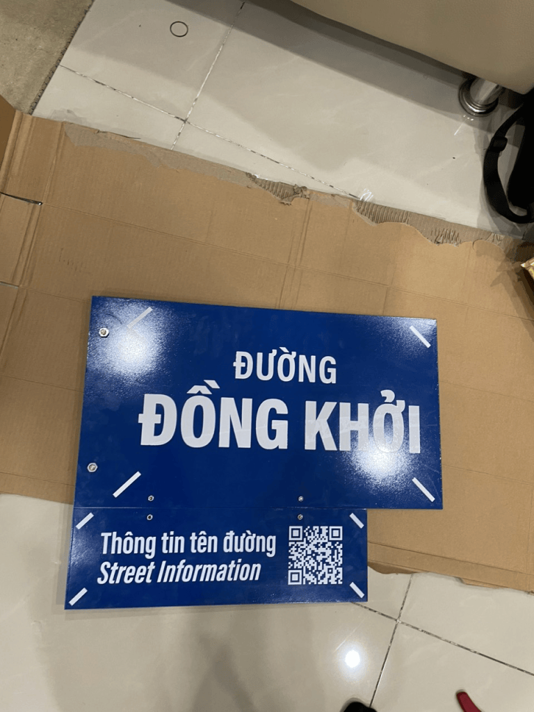
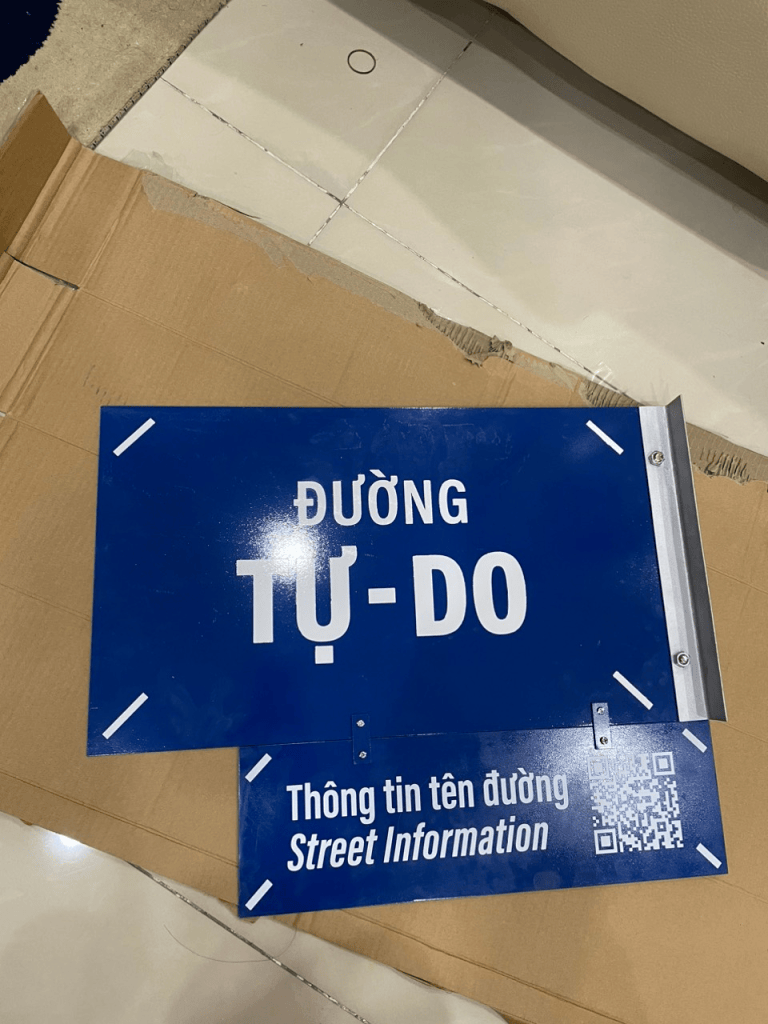
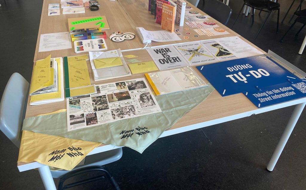
Besides the usual touchpoints, I found the adaptation of street signs to be particularly interesting. One of the subtle nuances of the Reunification event is the change in street names that occurred during the transition period between the two governments.
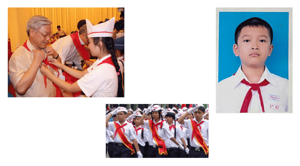
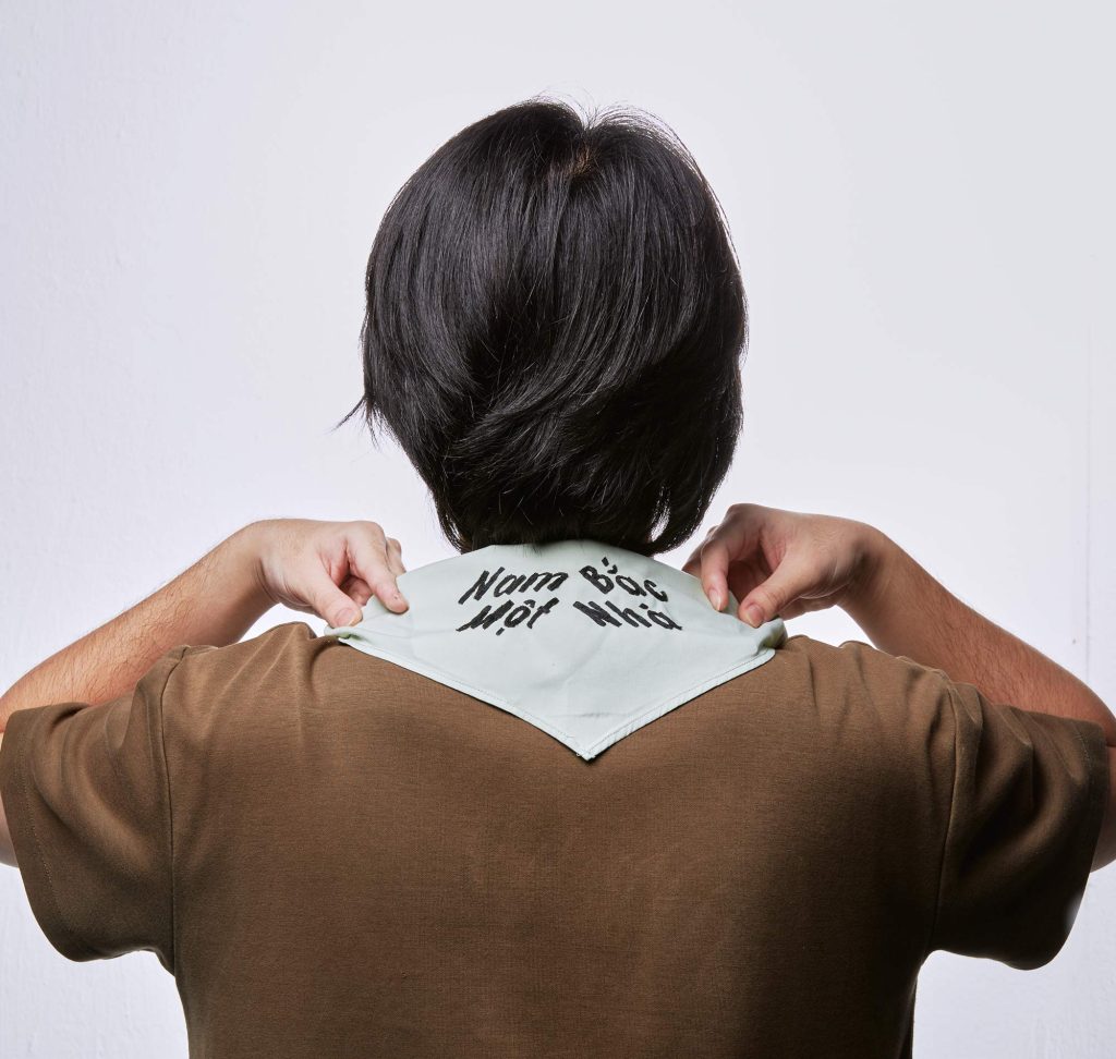
I wanted to use the yellow scarf as a touchpoint. It’s a reference to the iconic red scarf or ‘khăn quàng đỏ,’ which was mandatory for students as part of their school uniform.
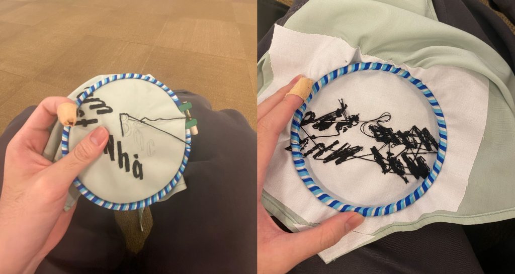
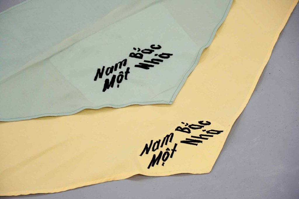
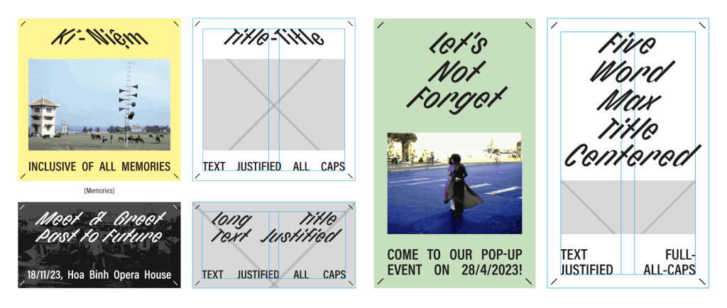
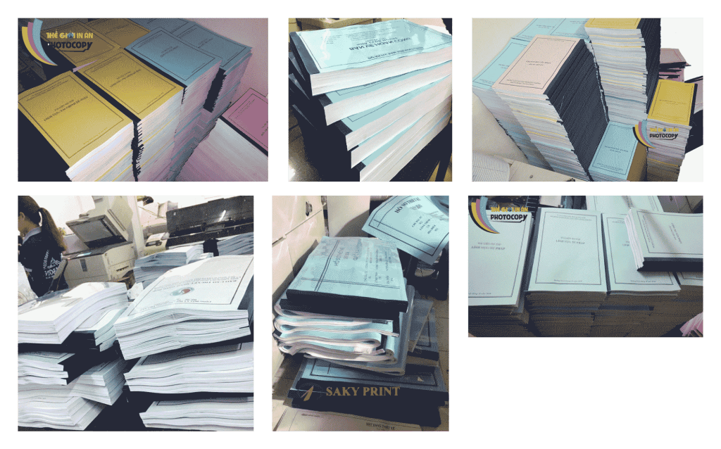
When designing print materials, I intentionally chose to work with materials and formats that are ubiquitously recognized in the Vietnamese context.
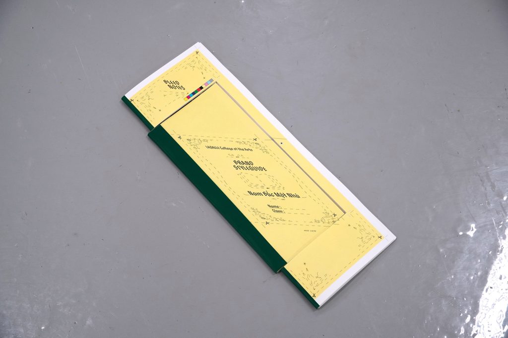
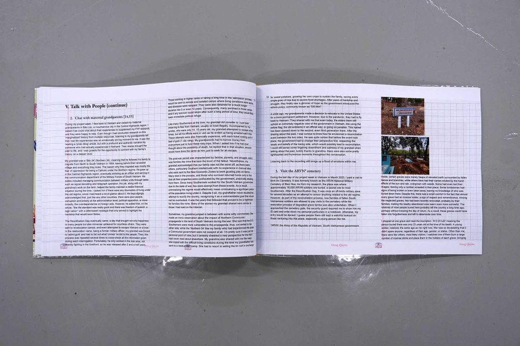
The “Bleed Notes” have a hollow center, preserving only the bleed area (hence their name), which is typically discarded during the printing process. They were crafted from the remnants of the main Brand Styleguide book.
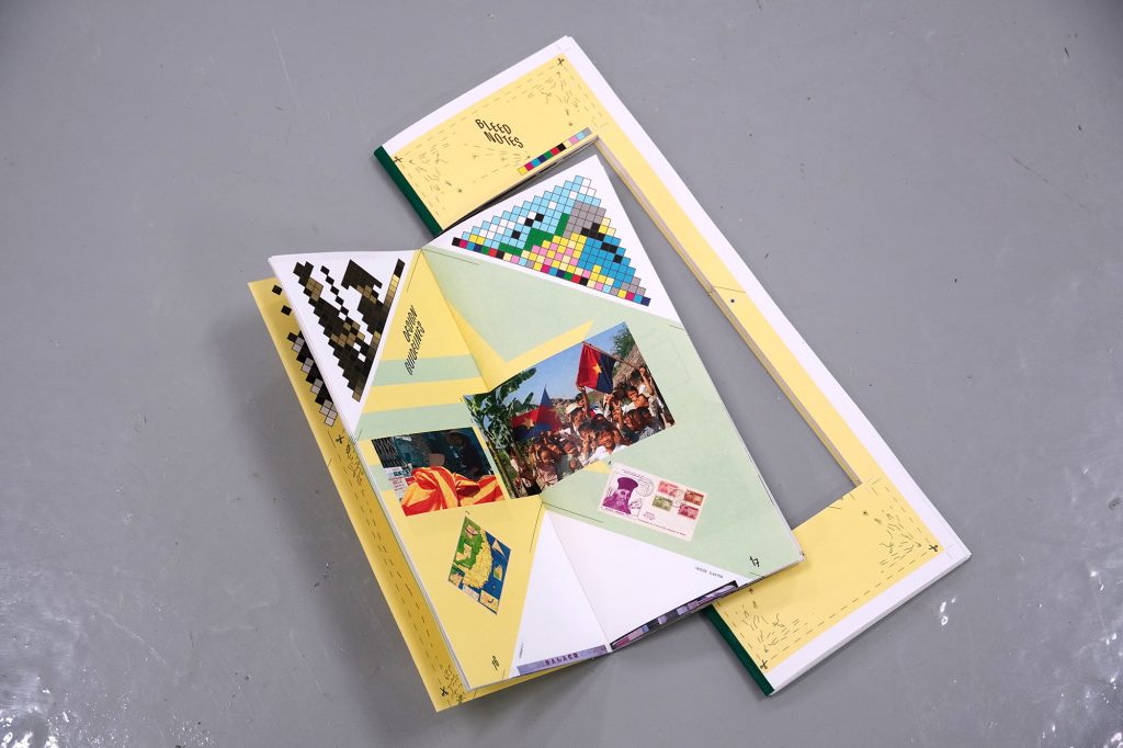
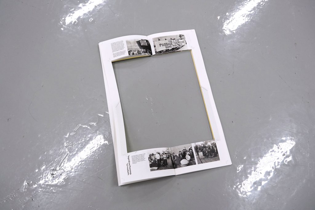
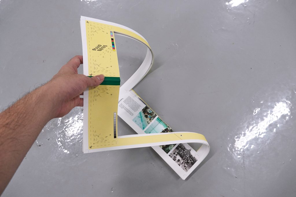
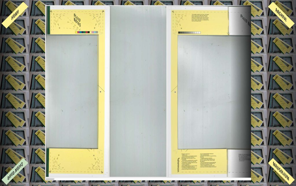
You can view the scanned version of the Bleed Notes online here nam-bac-mot-nha.vercel.app/bleednotes
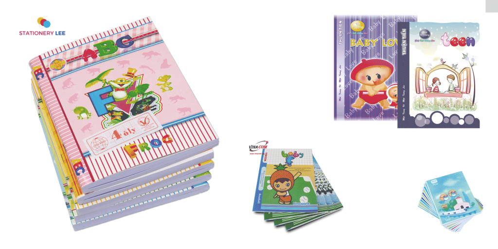
Continuing the theme of incorporating local print inspirations from the Brand Styleguide book, this time I used student notebooks that I brought way from Vietnam as materials for the CPJ.
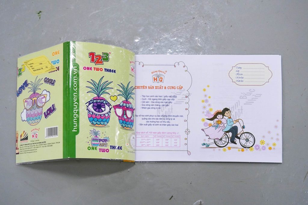
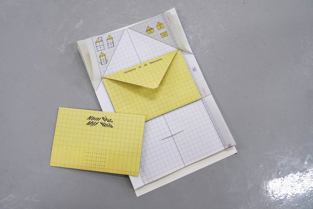
A notebook that contained ready-made envelopes. Each piece of paper inside is instructed to be folded into an envelope.
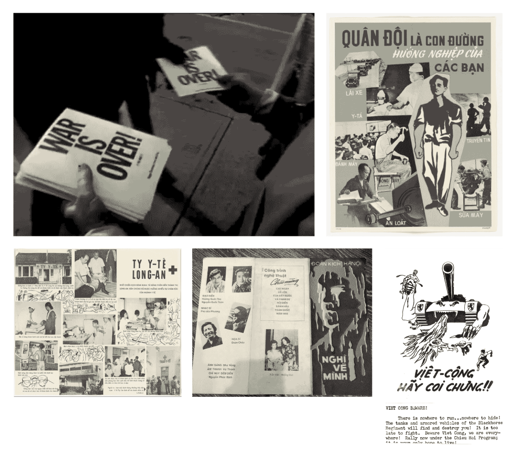
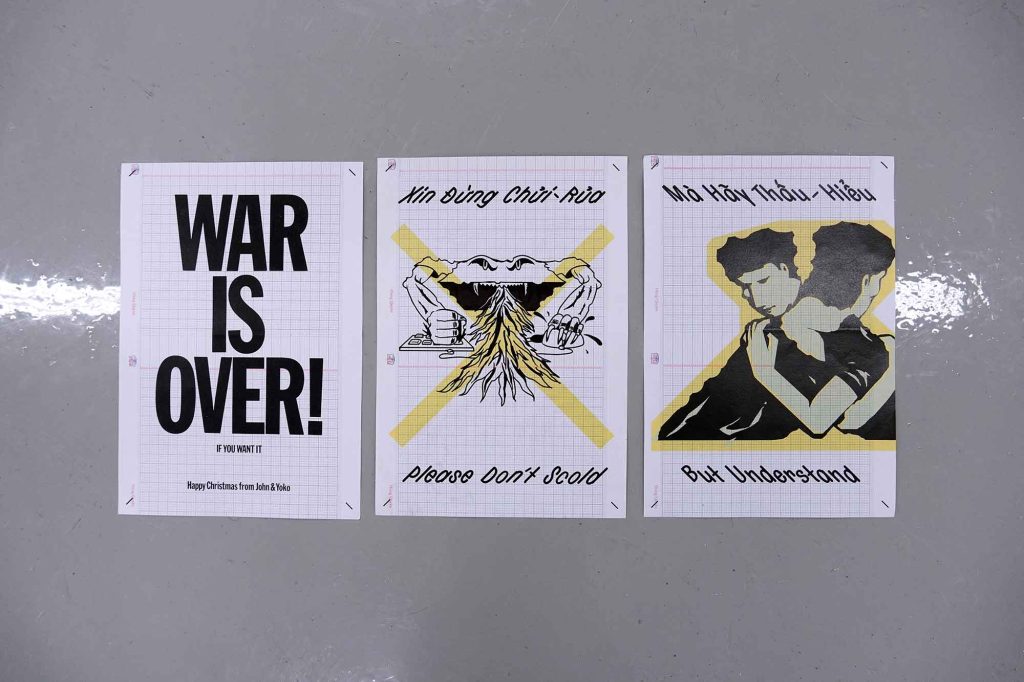
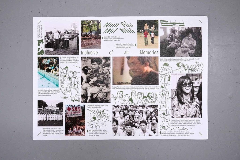
The posters were designed to be adaptable and incorporate various illustration styles, drawing inspiration from historical propaganda posters during the war, as showcased in the examples below.
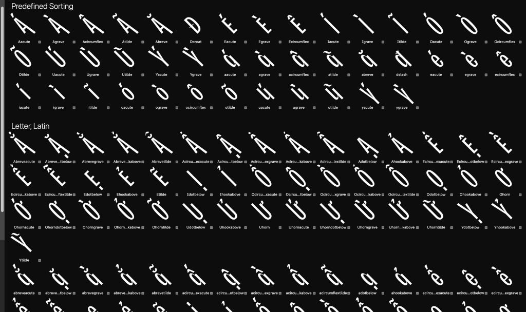
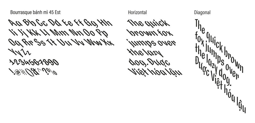
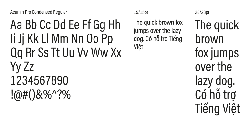
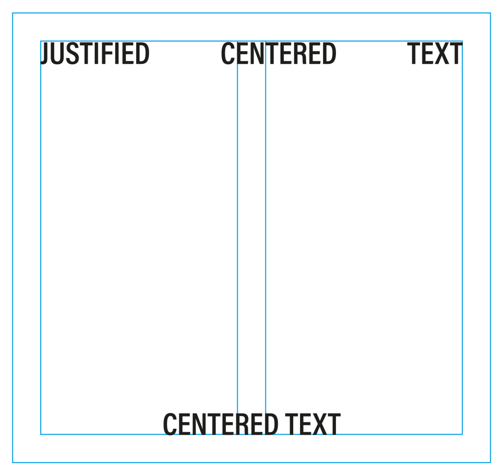
This website adhered to the visual identity, incorporating slanted strokes as the primary design ingredients.
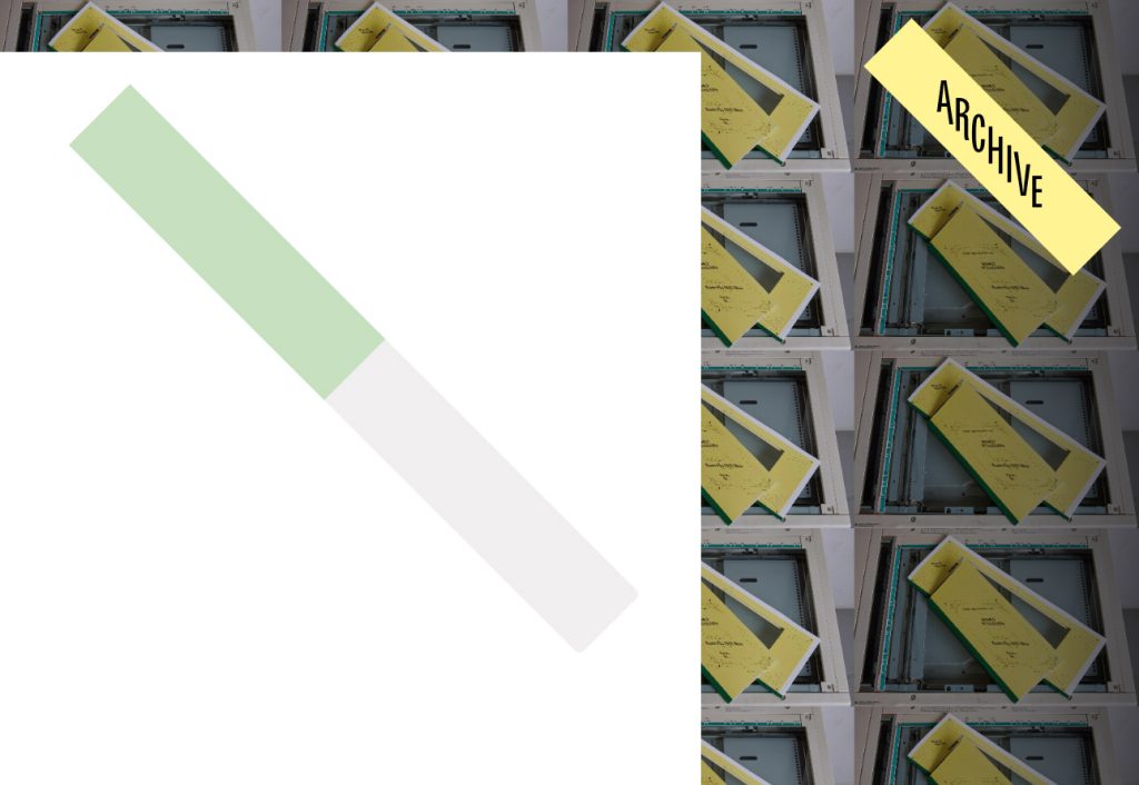
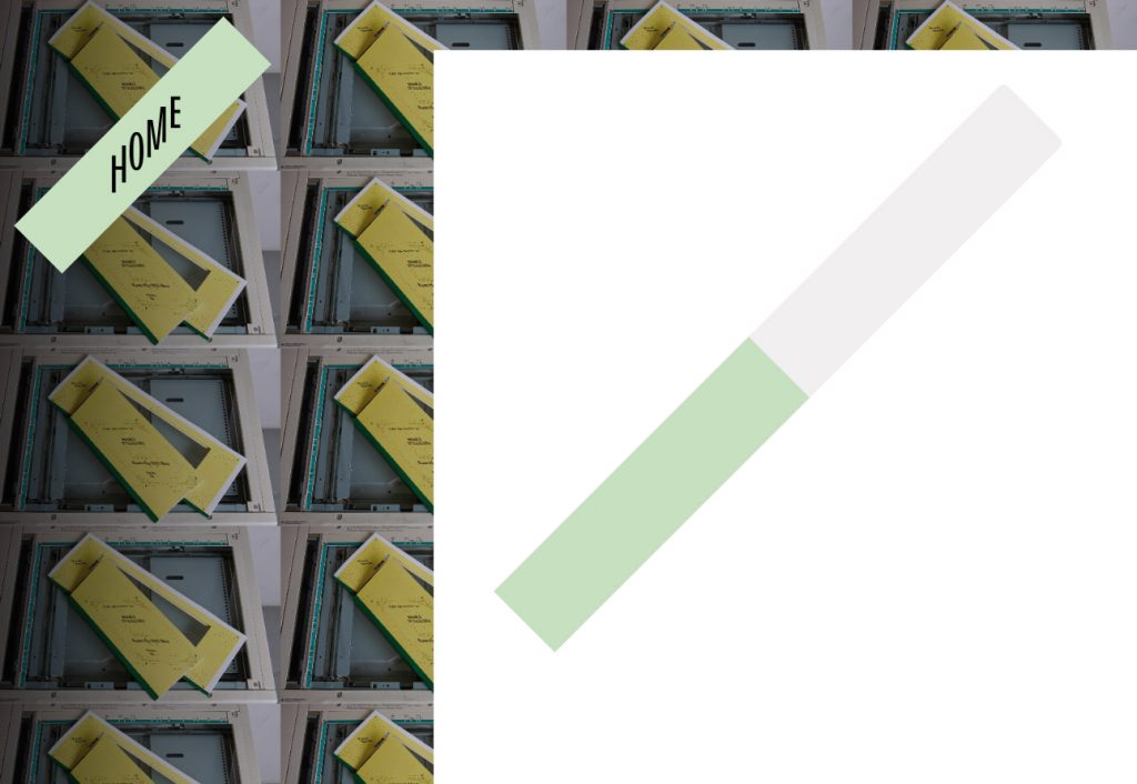
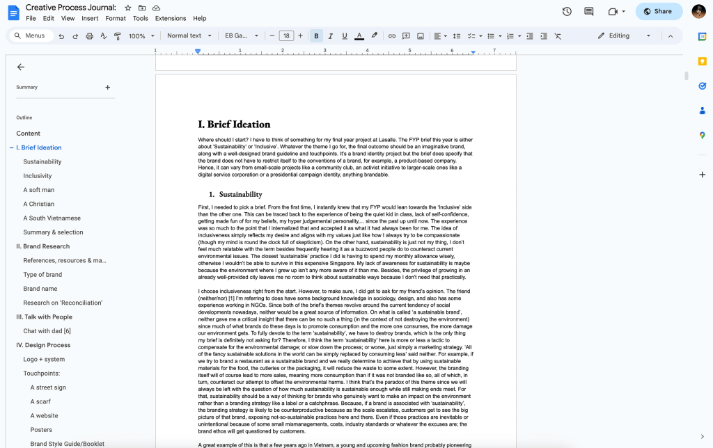
For the digital Creative Process Journal, I wanted to spice it up by wrapping the text content below the 2 slanted strokes. It gives a fun visual twist on scroll, and those slanted lines work as scrollbars.
I’m so happy that it received the Creative Conscience Award 2023 and got featured on Slanted Magazine #42 – Books!
Thanks to everyone who helped me throughout this project, one way or another:
Special thanks to Giun Trym, Tường Vi Ng, my lecturers Joselyn, Felix, and Joanne, chị Ven, chị Tường Nguyên, anh Triết, chị Nhung, chị Phương, my dad, my mom, my grandparents, my uncle, Duy Psycoreboy, anh Tân, chị Trang, Pauline, Eka, Joseph, Tiara, Vũ Phạm, Hải Vân, Ziêm, Sinprint print shop near Burger King, and a shoutout to the display font I used–’Bourrasque’ from Bureau Brut.
